用户滚动前的第一部分
一侧图一侧文字:
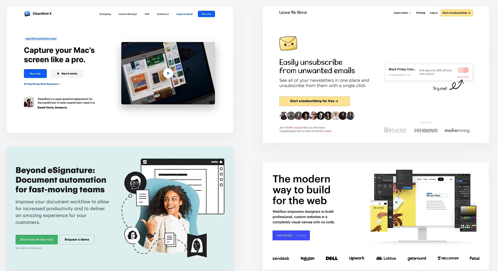

背景图加文字(逐渐被上面取代):
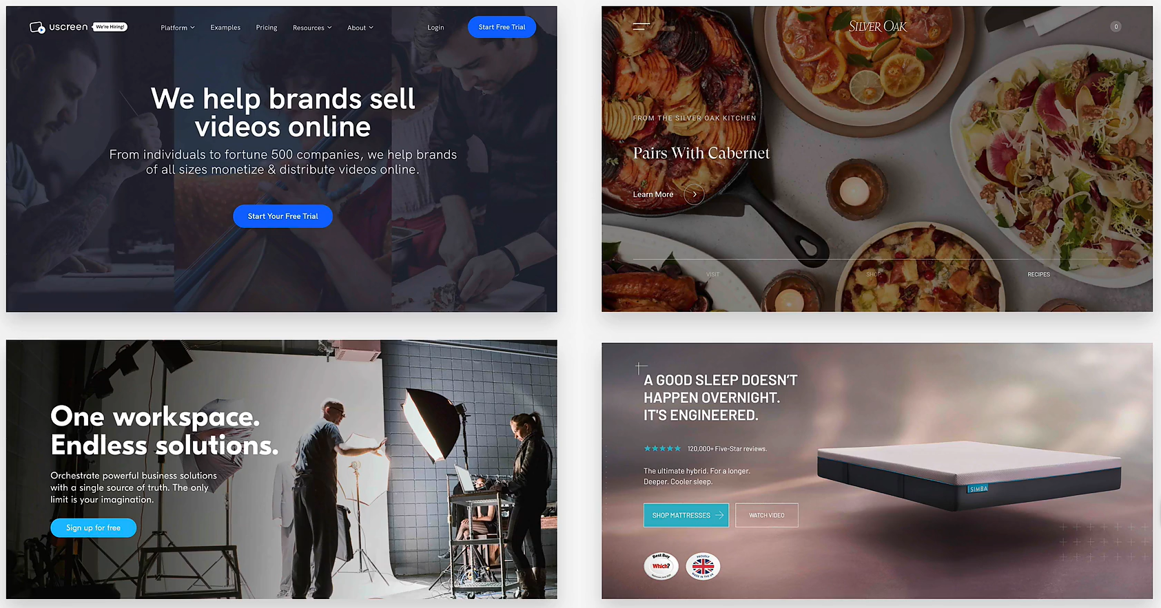
案例
背景图加文字
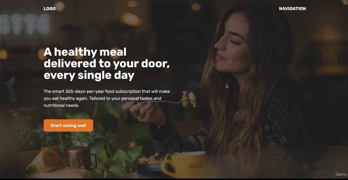
想要让一个内容占据整个视窗而非整个页,可以使用 vh 单位, 如 height: 100vh。
<!DOCTYPE html>
<html lang="en">
	<head>
		<meta charset="UTF-8" />
		<meta name="viewport" content="width=device-width, initial-scale=1.0" />
		<title>Omifood Hero Section</title>
		<link rel="preconnect" href="https://fonts.gstatic.com" />
		<link
			href="https://fonts.googleapis.com/css2?family=Rubik:wght@400;600;700&display=swap"
			rel="stylesheet"
		/>
		<style>
			* {
				margin: 0;
				padding: 0;
				box-sizing: border-box;
			}

			html {
				font-family: "Rubik", sans-serif;
				color: #444;
			}

			.container {
				padding-top: 32px;
				margin: 0 auto;
				width: 1200px;
			}

			header {
				/* background-color: orange; */
				height: 100vh;
				position: relative;

				background-image: linear-gradient(
						rgba(0, 0, 0, 0.6),
						rgba(0, 0, 0, 0.6)
					),
					url(hero.jpg);
				background-size: cover;
				color: #fff;
			}

			.header-container {
				/* background-color: red; */
				width: 1200px;
				position: absolute;
				left: 50%;
				top: 50%;
				transform: translate(-50%, -50%);
			}

			.inner-header-container {
				width: 50%;
				/* background: blue; */
			}

			nav {
				font-size: 20px;
				font-weight: 700;
				display: flex;
				justify-content: space-between;
			}

			h1 {
				font-size: 52px;
				margin-bottom: 32px;
			}

			p {
				font-size: 20px;
				line-height: 1.6;
				margin-bottom: 48px;
			}

			.btn:link,
			.btn:visited {
				display: inline-block;
				padding: 16px 32px;
				background-color: #e67e22;
				font-weight: 600;
				color: #fff;
				text-decoration: none;
				border-radius: 9px;
			}

			h2 {
				font-size: 44px;
				margin-bottom: 48px;
			}

			section {
				padding: 96px 0;
			}
		</style>
	</head>
	<body>
		<header>
			<nav class="container">
				<div>LOGO</div>
				<div>NAVIGATION</div>
			</nav>

			<div class="header-container">
				<div class="inner-header-container">
					<h1>
						A healthy meal delivered to your door, every single day
					</h1>
					<p>
						The smart 365-days-per-year food subscription that will
						make you eat healthy again. Tailored to your personal
						tastes and nutritional needs.
					</p>
					<a href="#" class="btn">Start eating well</a>
				</div>
			</div>
		</header>
		<section>
			<div class="container">
				<h2>Some random heading</h2>
				<p>
					Lorem ipsum dolor sit amet consectetur adipisicing elit.
					Beatae et aspernatur, aperiam quisquam omnis laboriosam
					voluptatum voluptatibus est deleniti totam placeat excepturi
					ipsum dignissimos, quis sit unde, deserunt libero minus.
				</p>
			</div>
		</section>
	</body>
</html>